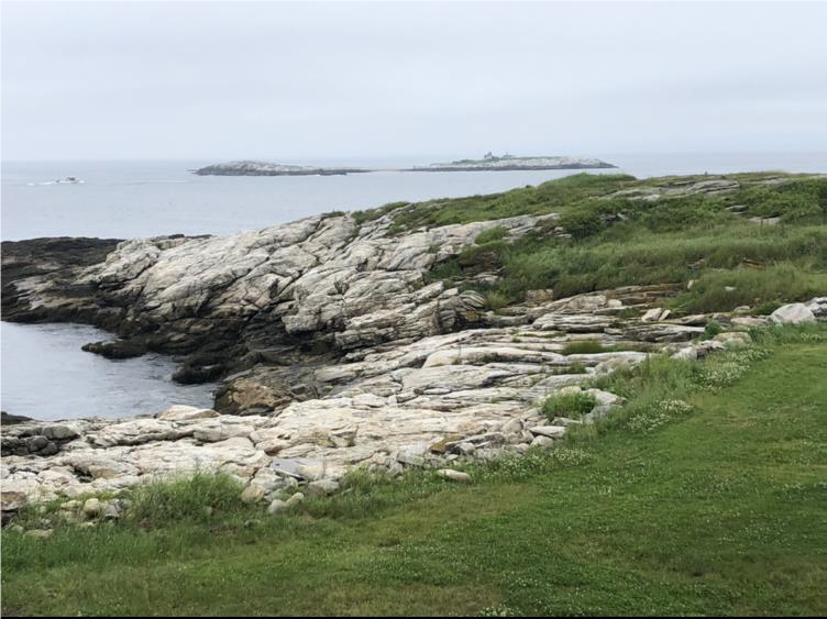
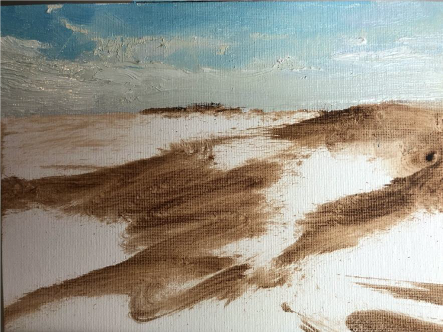
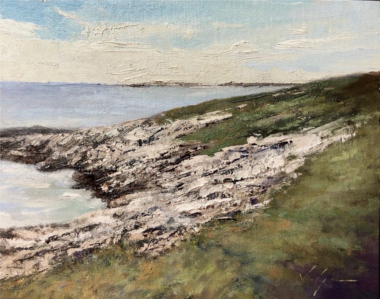
I chose this photo because I like the composition – it has plenty of contrast and perspective, interesting texture and shape variations, and it hints strongly at the characteristic rocky, haphazard terrain of Star and the Shoals. That’s what I love about the Shoals, that elemental disorder. The great American novelist Nathaniel Hawthorne described it like this: “It is as if some of the massive materials of the world remained superfluous after the Creator had finished, and were carelessly thrown down here, where the millionth part of them emerge from the sea, and in the course of thousands of years have become partially bestrewn with a little soil.”
From the outset, I decided this would be a fairly straightforward, traditional landscape painted in the prevailing neo-Impressionist style favored by most the of contemporary landscape and plein air painters pushing around paint in America today.
I’ll break the process into five steps:
1. The sketch
2. Painting in the sky
3. Blocking in the darks
4. Adding the lights
5. Putting in the details, adjusting the values, and adding finishing touches
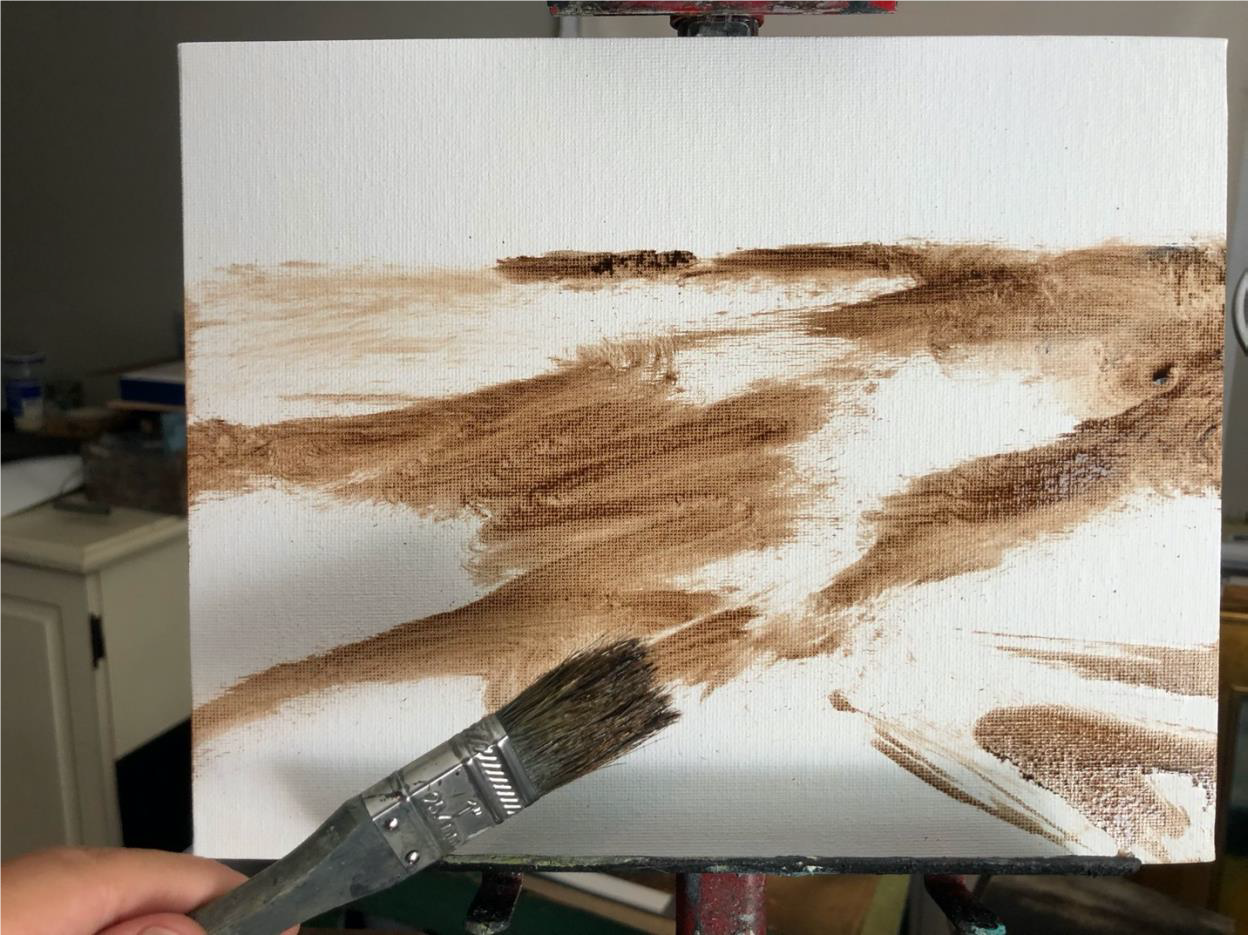
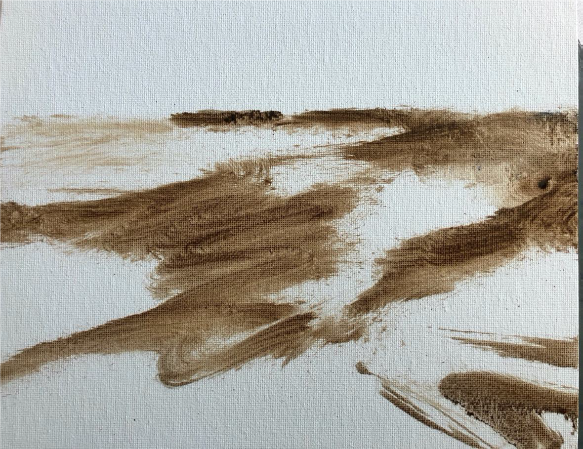
Step 1. Drawing a sketch. I chose to start this painting with a rapid sketch (probably took all of 1-2 minutes). I find it’s helpful for getting the overall composition right at the outset. It’s said every painting lives or dies in the first 15 minutes, and it’s because of the design – nothing can fix a painting with a weak underlying abstract architecture. Here I’ve departed from the photo in lots of ways, but the main things are three: 1. I added diagonal lines from the bottom right foreground to lead the eye in to the design. 2. I connected the islands to the land mass – I have a rule that everything in a painting connects, usually accomplished by connecting “the darks” (shadows, etc.) and 3. I flatted out the picture plane a little so the rocks in the foreground spill out into the left-hand corner of the foreground, again in a leading-in diagonal, to keep the eye moving and to prevent the composition from getting static. I’ll be making similar diagonals in the sky too.
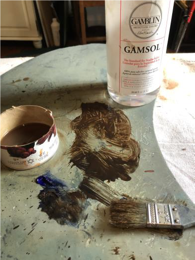
To do the sketch, I used a ragged brush (so I can’t get too fussy) and mixture of burnt umber (brown) and ultramarine blue thinned with Gamsol (odorless turpentine substitute).
Here’s the completed sketch:
Step 2. Painting the sky. Next thing I did was paint in the sky. Note the diagonals, again, on both the right and left hand sides of the picture. I don’t always put in the sky first, but sometimes it does seem to help you know how light or dark to make the adjacent land or ocean masses (this is known as “gauging your values”. It’s also encouraging to get a good sky done – you feel like, with a good sky, you’re off to a good start and maybe this painting will be a success after all.
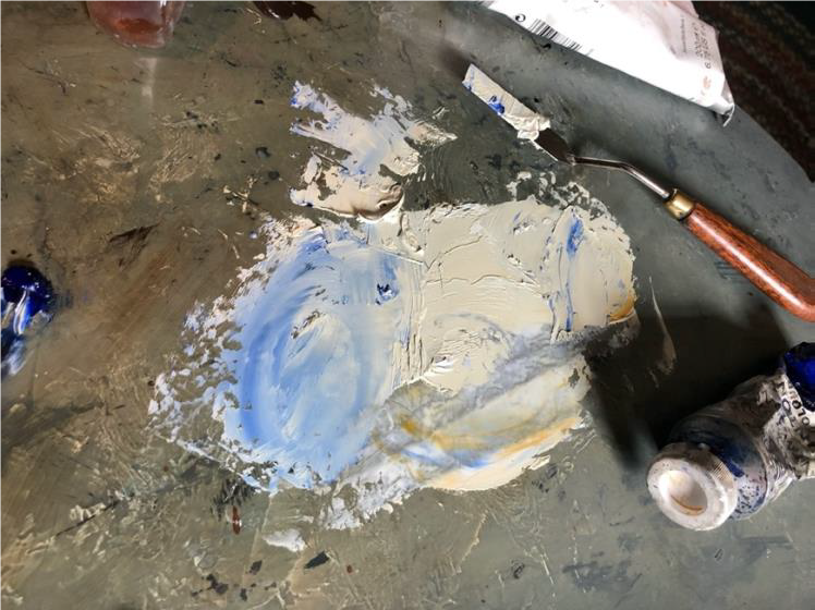
The sky colors are ultramarine and Prussian blue mixed with Titanium white and a smidge of yellow ochre. I applied the blue layer first, rather thinly, with a brush, and then dragged a thicker quantity of light yellow pigment over top of it with the side of my palette knife.
Note how the sky gets lighter and lighter as it nears the horizon, until it’s almost just yellow-white. Skies do that, and it gives your middle-ground sufficient contrast if you keep the sky from being too dark.
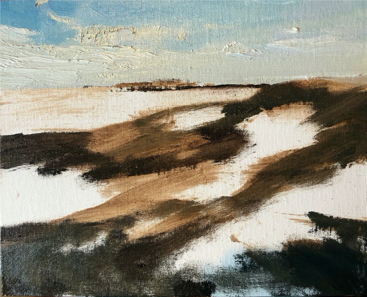
Step 3. Blocking in the shadows. Next I blocked in the shadows with a darker version (more blue this time) of the same blue-brown mixture I used in the initial sketch. This is where I really think about design and creating a clear and interesting / dynamic path for the eye through the painting. I consciously try to connect the darks, so that no part of the composition is stranded, something I learned from studying Japanese prints. This is also the reason I tucked the islands behind the land mass in the upper right, so they would literally connect to the rest of the darks.
Step 4. Adding the lights. In oil painting, one generally starts with the darks and works up to the lights (the opposite of how one approaches a watercolor). I painted the rocks and the grass right over the shadows, adjusting details as I went. The grass I painted mostly with a brush, the rocks I did with the edge of the palette knife. I used an array of greens, mixed to the warm side and broken up in Impressionist fashion with flecks of ochre, violet, brown-green and blue-green. Green is notoriously hard to handle in painting because it can look too hard and bright for its own good.
I felt like the “real” painting was finished at this point – it was “saying” what I had intended the painting to “say,” which was to tell about the massive pieces of creation “carelessly thrown down here” by God, as Hawthorne put it. The outline of the rocks differs considerably from the photo; I deliberately paid more attention to the “jagged” feeling I was getting into the rocks than to the factual topography of that portion of Star – at some point I stopped looking at the photo and just worked those shapes with the palette knife until they expressed the feeling I wanted, Later I would go back and adjust a couple angles and add a very few factual details from the photo just to make sure it was still that spot on Star. Artists have to lie to tell the truth.
I added a sprinkling of sunlight along the rim of the near slope and painted in the sea. I put in a few more details and added highlights here and there with brighter, higher-keyed touches in the grass and the stones. I had to must the brightness of the rocks in a few place so that at no point were they a higher value (brighter) than the sky. I also re-darkened shadows in some spots, most importantly in the bottom right corner, where they’d somehow gotten too light during the grass-painting phase.
This was, I thought, finished, until I noticed that the water in the foreground is brighter (higher value) than some of the clouds, which besides being unnatural makes the painting seem relatively dull. I needed to go back into that area and add darker values of the same colors, and when I did, I realized I wanted to then adjust the value of the ocean in the background too.
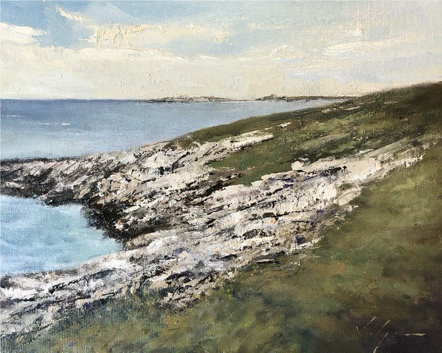
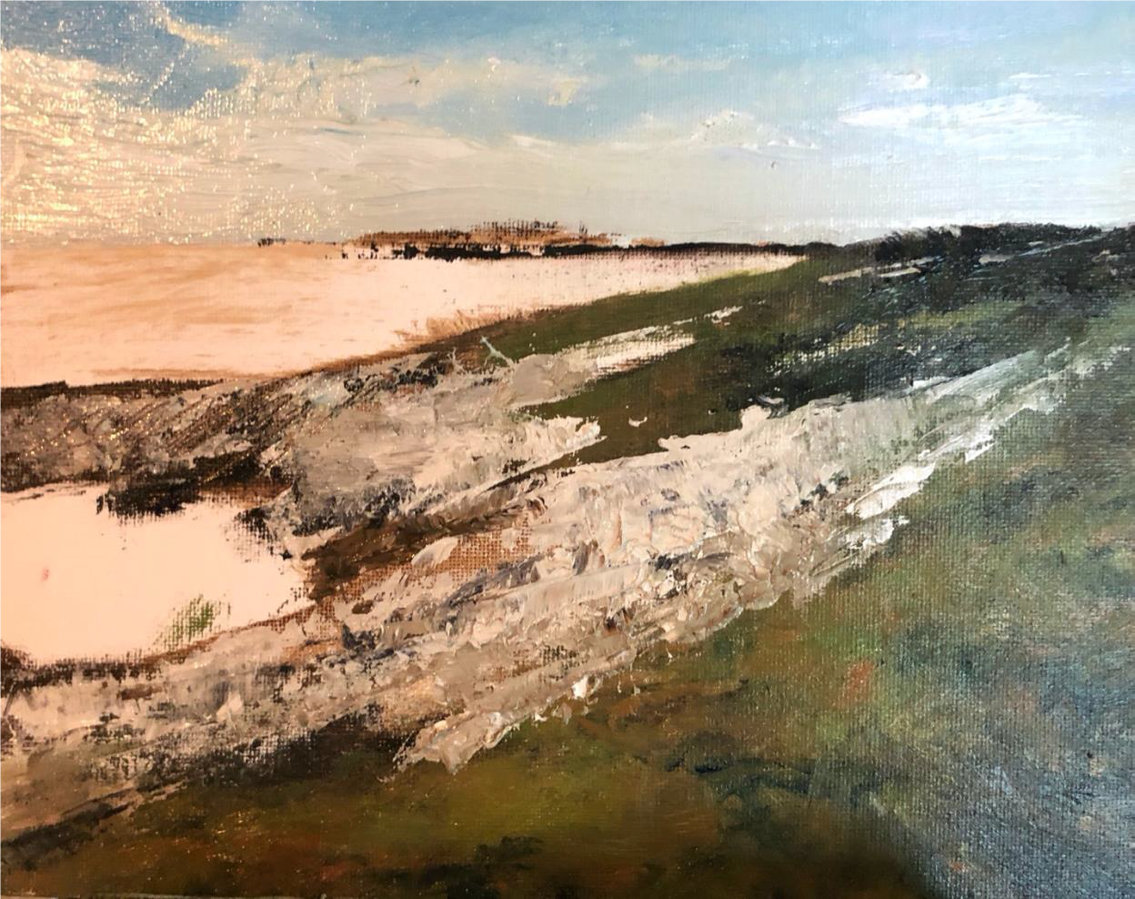
Here is the finished painting. Again, the colors are different from those in the photo of course, because it was more important to me to get a particular feeling into the painting than to copy the original exactly, which was a bit too dull, gray, and cold for the mood I wanted. I wanted a warmer, more buoyant, uplifting feeling (without becoming cliché), and I feel that I got enough of that to satisfy me while also conveying that rough-edged primordial beauty which was the original reason and impetus for painting the picture in the first place.
You can see more of my work at www.christophervolpe.com, where you can also enquire about classes and workshops, check out my blog, and sign up to receive an intermittent newsletter with new work and stories from the wild and woolly world of contemporary art.